 In Part 1 of this series, we talked about website navigation and how it affects the user experience on your desktop website. Today, we’re going to turn our attention to mobile …
MOBILE NAVIGATION
Just when you thought we were probably done talking about navigation — I spring mobile nav on you. Mobile nav needs just as much attention as desktop navigation. Luckily the same principals apply here, but they look different because we’re on a mobile platform.
Here are a handful of examples of mobile navigation with an excellent UX.
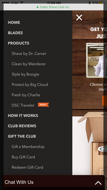
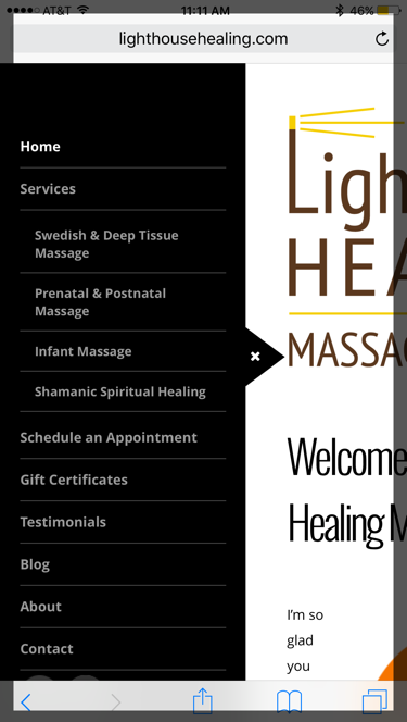
The first example is from the Dollar Shave Club mobile site. The second example is from the Lighthouse Healing Massage therapy site (built by Cuppa SEO). In both cases, the navigation follows a clear, easy to digest hierarchy …
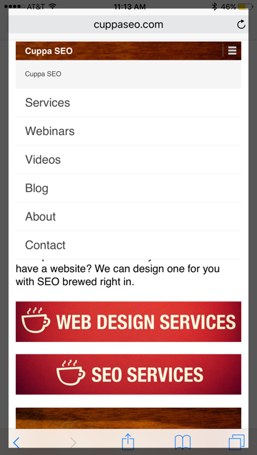
If you have multiple services or products, another nice touch is to implement an accordion-style mobile nav. In other words, one that expands and contracts when there’s a dropdown menu. Here’s what this looks like on the Cuppa SEO site.
On the left is an example of the collapsed navigation. On the right is an example of the expanded nav, which is triggered when you click on “Services.”
NAVIGATION ORDER
The final point I’d like to cover regarding navigation is the order in which your tabs should appear.
It can be tempting to lead with your About section, just after your Home tab, but it’s not the optimal place for it. Businesses often feel it’s important that potential customers know their history and what they’re about. But if you remember when we talked about content in Part 1 of the book, this information is often less important to the customer. What they care about is their pain points being addressed.
Keith Gilmore, a local Madison friend and conversion expert, once told me a story about a person who broke their arm and was rushed to the hospital. When the person got to the emergency room, the doctor began telling him about her credentials — where she went to school, when she graduated, the different hospitals and private practice’s she’s worked at over the years, and how many broken bones she’s set back into place.
Now, do you think for one second that the patient cared about any of this? That patient is sitting there IN PAIN! He wants the doctor to fix his pain!
So, just as you need to keep your content customer-centric, the same holds true for your navigation.
Instead of a nav that’s ordered like this …

Make your nav look like this …
In the first example, you’re offered to check out “About,” “Why Artisan,” and a “Tour,” before you get to the services they provide. Yes, it only takes a few seconds to find the “Services” tab, but why diminish the UX in your nav unnecessarily? Remember, most people look for services when they’re in some kind of pain. Address their pain!
Social Side Note: notice that this website navigation also includes social buttons right in the navigation. Would you want to check out a dentist’s Facebook page if you needed a root canal? Although there are some cases where use of social buttons can actually be helpful (as we’ll see shortly), in most cases they won’t prove helpful as part of your navigation.
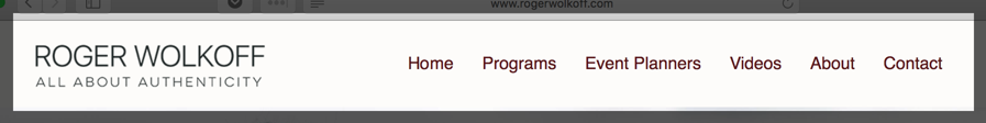
The second example is from one of our client’s websites, Roger Wolkoff, and of course it provides the “Programs” and “Event Planners” tabs right up at the front of the nav — making it all about the customer.
We hope this helps you create a mobile website navigation that’s geared toward a great UX!
Related Topics