When it comes to website navigation (nav), it’s always a good idea to be as clear as possible. Like the Dollar Shave Club homepage example below, you need to ensure that your navigation makes sense and involves 0% guesswork. In other words, this is not the place to be cute or metaphorical.
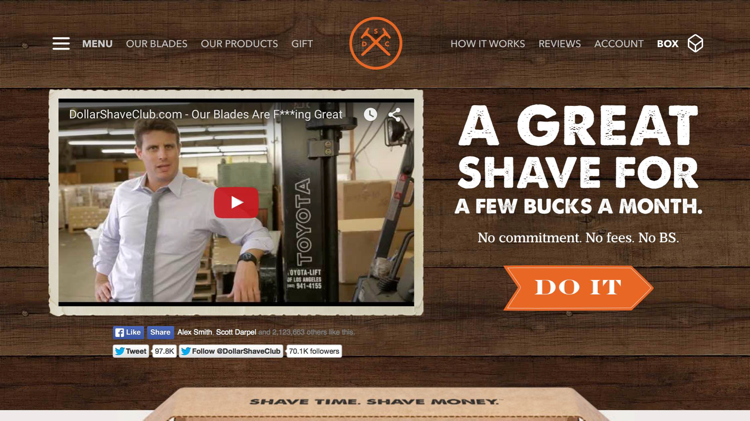
As you can see, Dollar Shave ensures that everything is clear in their navigation. “Our Blades,” “Our Products,” and “Gift,” all tell you exactly where you’ll land when you click on them. “How it Works,” “Reviews,” and “Account,” do the same. Crystal clear, right?
The only not-so-clear component of the Dollar Shave Club navigation is “Box.” This is actually what’s going to be contained in your next shipment, or box, but it’s not necessarily clear what this is until you’ve become a customer.
Dollar Shave Club also has what’s called a secondary navigation. You can see it on the left, where it says “Menu.”
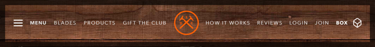
When you click on “Menu,” the secondary navigation opens up …
As you can see, the hierarchy of the secondary nav is identical to the primary nav, which is good.
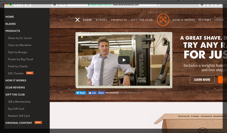
But here’s the question: why is this secondary nav here at all? What is the purpose of its existence? In terms of UX, it adds another element to the page. And from we’ve learned, the more elements a page has, the more a visitor has to think. The more they have to think, the better chance they will get distracted from what you want them to do.
On the one hand, when the secondary nav is collapsed, it’s is non-obtrusive. But, again, why is it there? The only difference between the secondary nav and the primary nav is the fact that the products are all laid out nice and neat in the secondary nav. But here’s the thing: this could EASILY be accomplished by simply creating a dropdown menu in the primary navigation under the “Products” tab.
When it comes to the user experience, if there’s a simpler way — do it. In this case, the simpler way is painfully simple AND OBVIOUS.
The only item in the secondary nav that doesn’t appear in the primary nav is “Original Content.” Essentially this is the Dollar Shave Club blog. This could easily be added to the primary nav as, “Blog,” rendering the secondary navigation useless in the process — which would make their user experience even better.
By the way, remember when I said that your navigation is no place to be cute or metaphorical? Dollar Shave Club forgot that when they decided to call their blog, “Original Content.” Now, since you’re on a shaving site, it’s implied that the content is going to be about shaving and men-related topics. But original content could be a lot of things — like a book, or the latest Netflix produced TV show — so why not just call it what it is, which is a blog?
Yes, this is a small point, and it may seem trivial. But how many ambiguous things does it take to make your visitor confused? Anything that is even remotely confusing needs to be made clear.
One Navigation
As you can see, whenever possible it’s always best to have ONE site navigation. For a large portion of websites, a single navigation with dropdown menus will suffice nicely. If you have a more complex hierarchy of subpages, it may be necessary to have a primary dropdown menu that drills down into a secondary dropdown menu.
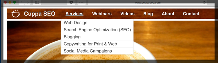
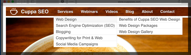
For instance, on the Cuppa SEO website, the primary dropdown menu looks like this:
And the secondary dropdown menu appears when you hover over one of the primary dropdown choices. In this case, my cursor was hovering over “Web Design”:
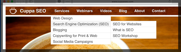
In this example, my cursor was hovering over “Search Engine Optimization (SEO)”:
To keep the UX clean, and easy for the user to digest, it’s important that the secondary dropdown be in alignment with whatever service or produce its expanding upon.
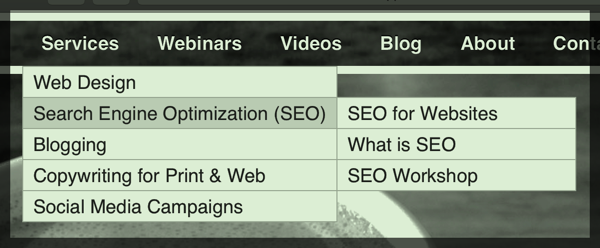
To further clarify what the secondary dropdown is associated with is to have the primary dropdown you’re hovering over change color. On the Cuppa SEO site this color change is very subtle, and does not translate well to print, so I’ve enhanced it here so you can see what I mean:
Other Types of Navigation
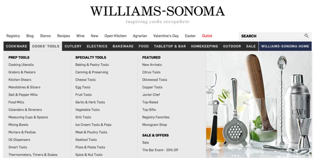
If you’re housing dozens — or even hundreds — of product pages, you can also use mega drop downs, like Williams-Sonoma …
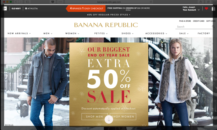
Or if you simply must have a secondary navigation, make sure it’s consistent on every page of your site like Banana Republic does.
Some sites are selective about when the secondary nav appears or is hidden. This can cause confusion, leading the visitor to feel stranded or lost (bad UX).
In the case of Banana Republic, the information contained in the secondary navigation is also present in their primary navigation. But the reasoning behind this is different than the Dollar Shave Club (DSC) example we examined above. With DSC, there wasn’t an obvious reason for the secondary navigation’s existence.
But in the case of Banana Republic, the secondary navigation is used very wisely.
It’s used on EVERY landing page for every product category (Men, Women, Petites, etc.) for a very specific reason: to help clarify what my options are WITHIN that particular product category without having to use the primary navigation.
With Banana, there are so many product pages that once someone drills down to a section they want to be in, having the secondary nav available on the left-hand side of the page actually improves the user experience. This is because, once a visitor has drilled down to a particular product category, the secondary nav acts as an at-a-glance guide as to what other options they have within that product category. In other words, it’s clarifying the situation, and placing the visitor on solid ground.
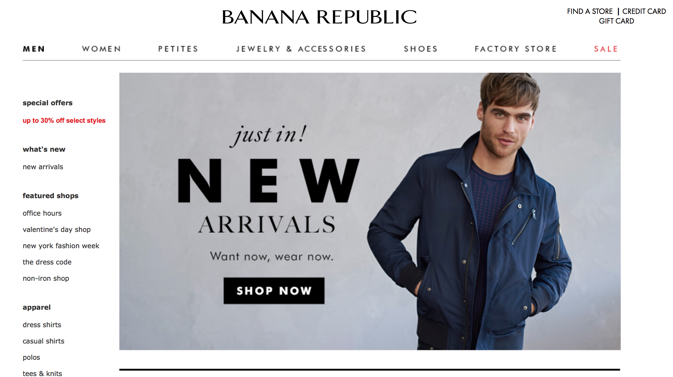
As you can see, the secondary nav is NOT present on the homepage …
This is not an oversight. The secondary nav has been removed with good reason: the visitor has not yet provided any information as to what product category they’re interested in shopping yet. And since the secondary nav is meant to provide easy clarification as to where you might want to go next within a specific product category, there’s no use for it on the homepage.
Typically, multiple navigation bars, or primary and secondary navigation bars can be tricky and difficult for the user to navigate — which means a bad user experience.
Let’s take a look at a site with multi-navigation hierarchies that can create a poor UX for a visitor …
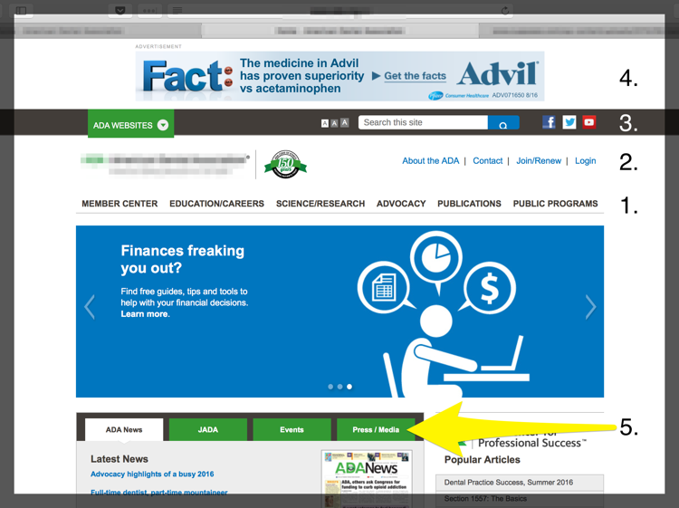
Navigation #1 & #2
In the above example, #1 is the primary navigation. Then you’ve got a secondary nav above it.
Already, the user’s focus is split in two — at least for a few seconds, which can be enough to confuse or distract someone. Not the desired effect.
Navigation #3
But this website isn’t done yet. The third navigation (#3) sits above the secondary nav. This is the search box and social buttons. It’s typically a bad idea to place social buttons at the top of a web page like this for two reasons:
- Social buttons add another layer of navigation to the site. Now the user’s focus is split into three.
- What is the purpose of those social buttons? To bring someone to one of your social media platforms, right? As we’ll see in Part 4 of this book, social media — very often — is a tool that helps drive people TO YOUR WEBSITE.
When you place your social buttons right up at the top of your page, in addition to competing with your primary navigation — it also runs the risk of directing someone AWAY from your website.
When this happens, you’re directing traffic the wrong way! Once we’ve got someone on our website, the last thing we want to do is have them leave! More on this in Part 4, but I wanted to address, albeit briefly here, too.
Navigation #4
Nav #4 is an advertisement for Advil. And although it’s not technically part of the navigation (it’s a call-to-action), I’m counting it here because it is taking up prime real estate where your primary navigation should be!
Navigation #5
This navigation sits mid page, disjointed from the primary navigation. Nav #5 contains news-centric information. Something that could easily be communicated through adding “News” to the primary nav, along with a dropdown menu to accommodate each tab.
At this point, the visitor’s focus has potentially been split five times — and that’s not even counting the slider they use for multiple hero images (bad for UX) and the other links and call-to-actions on the page.
Whew! That’s all we’ve got for today regarding UX and desktop navigation. Next time, we’ll tackle mobile navigation.
Related Content:
User Experience & Website Navigation Video