 I tried to go shopping online the other day on a website that shall not be named (to protect their identity for the faux pas they made).
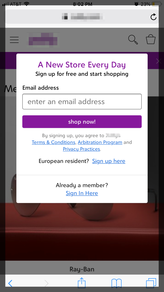
When I arrived on the site, I was instantly greeted by a pop-up (shown to the right) that asked me for my email address. In fact, it basically demanded my email address before I could shop the site.
What?
I’ve seen this before, and I’m sure I will see it again, and it’s a big mistake in the world of web design.
Yes, acquiring visitor emails to grow a company’s email list is a pretty simple, standard conversion strategy. But the way this company has implemented this strategy here carries a hefty cost because …
When a company is so blinded by a particular strategy, in this case attaining “new member” emails, they’re forgetting a couple of cornerstone concepts:
1. They were so focused on their conversion strategy that they forgot about their main goal — SELLING.
This company in business to sell product — first and foremost — not accrue email addresses. Having a nice email list can help with long-term relationship building and potential sales, but by restricting access to the site unless a visitor forks over personal information makes it impossible for visitors to shop without making a commitment of some kind — which is bad for business (and for the user experience, as we’ll soon see).
Why not let me shop and then have me sign up to become a member when I’m ready to complete the transaction? Attaining my email at the purchasing stage makes a lot more sense, doesn’t it? After I’ve had a chance to peruse the site, see what kinds of products you have, and place some in my cart? In this case, becoming a member and sharing my email feels a lot more natural.
2. They forgot about providing the very best user experience possible.
The second problem here is this conversion methodology — disallowing me from shopping the site unless I hand over personal information — is a poor user experience for the visitor. User experience is the positive, negative or neutral experience a visitor has online, or in the analog world for that matter. And when a visitor arrives, and is immediately faced with a brick wall to entering the site — it’s not going to make anyone feel comfortable or welcome, and it’s certainly not going to build trust.
What this company is doing breaks a cardinal rule … they’re making it all about themselves and their goals, instead of focusing on their visitors’ needs. Essentially, there’s an initial ask of each and every first-time visitor — a demand for something — without offering anything tangible in return. Visitors can only assume that if they sign up they’ll start receiving potentially unwanted emails from this company — and they don’t even know what’s for sale on the site!
As you can see, when it comes to website conversion, it’s important for an organization to understand what their top goals are, and how they can best connect with their customers and potential customers to attain those goals in an ethical way.
Want more tips and insights from Cuppa SEO?