
In this installment of our Understanding Online Marketing series, we’ll be taking a look at the User Experience (UX), and its importance on your website.
What is UX?
The user experience is exactly what it sounds like: a positive, negative or indifferent experience a visitor has with your brand online, or in person.
When the UX is good, a visitor will stick around, and actually look forward to coming back to your site. In a way, good UX is similar to going to your favorite restaurant where you love the food, the wait staff and the atmosphere.
Let’s examine some key areas where user experience comes into play in your web design …
Navigation
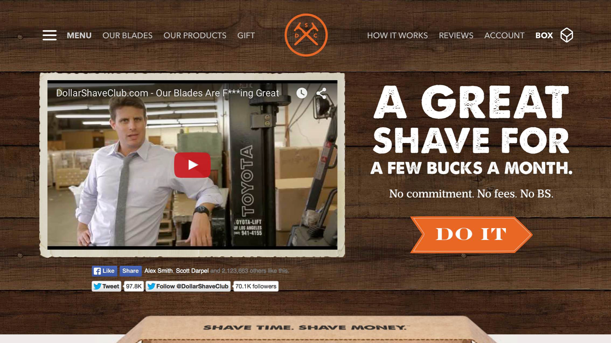
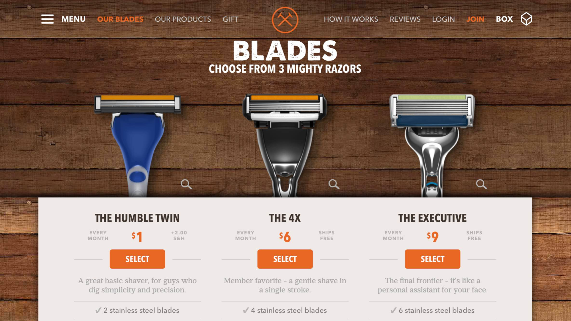
When it comes to site navigation, it’s always a good idea to be as clear as possible. Like the Dollar Shave Club homepage example below, you need to ensure that your navigation makes sense and involves 0% guesswork. In other words, this is not the place to be cute or metaphorical.
Whenever possible, it’s always best to have ONE site navigation. For a large portion of websites, a single navigation with dropdown menus will suffice nicely. If you have a more complex hierarchy of subpages, it may be necessary to have a dropdown menu that drills down into a secondary dropdown menu.
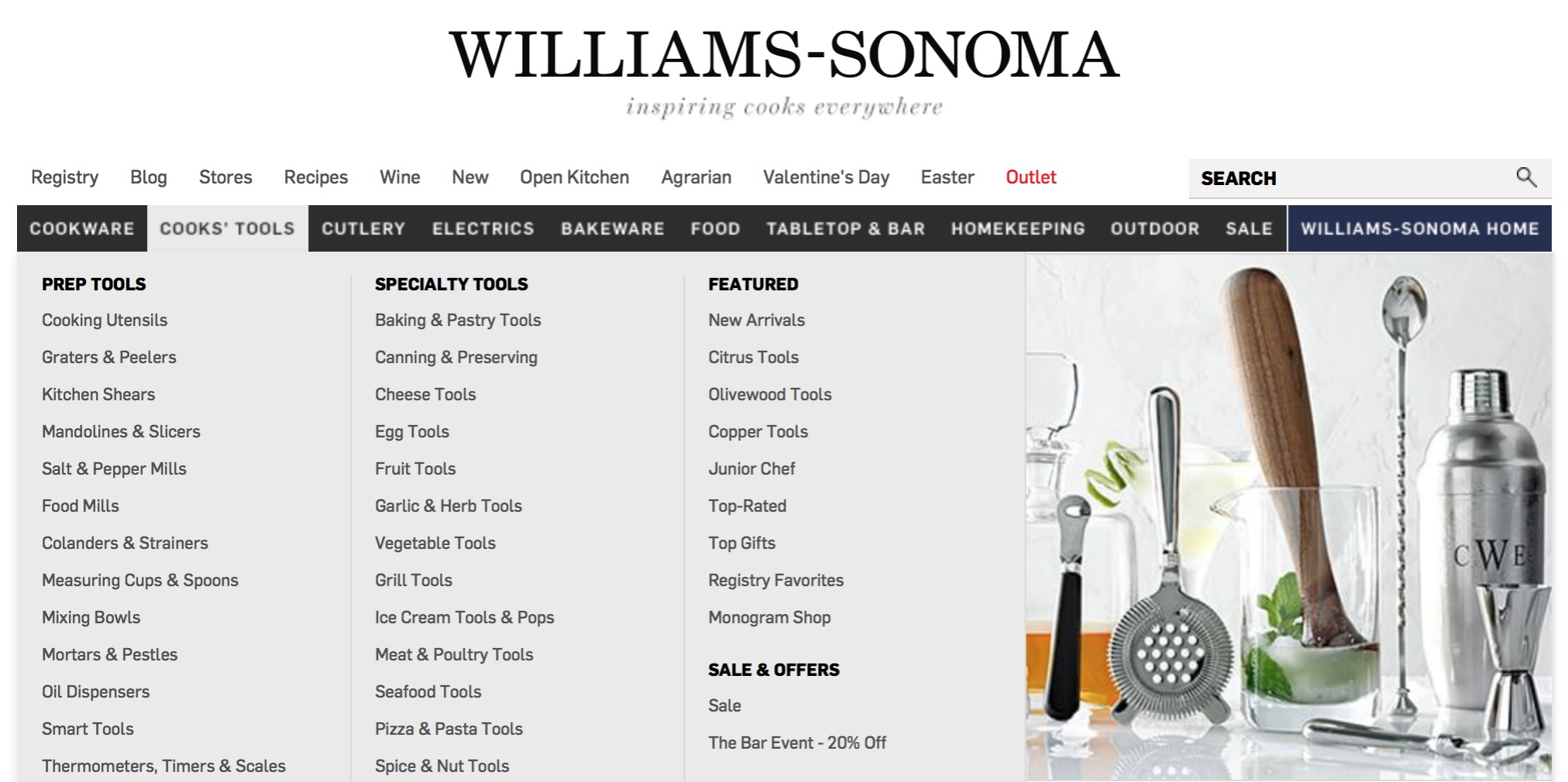
You can also use mega drop downs, like Williams-Sonoma …
Or if you simply must have a secondary navigation, make sure it’s consistent on every page of your site like J. Crew does …
Typically, multiple navigation bars, or primary and secondary navigation bars can be tricky and difficult for the user to navigate — which means a bad user experience.
Homepage
In addition to successful navigation, the Dollar Shave Club homepage example above also provides a solid overall user experience. It’s clear, with just a couple of options to choose from: (1) watch the video; (2) click on the “Do It” call to action (CTA). The sparse copy above the CTA is clear, compelling — and expresses two great benefits, “a great shave, for a few bucks.” This is UX at its finest.
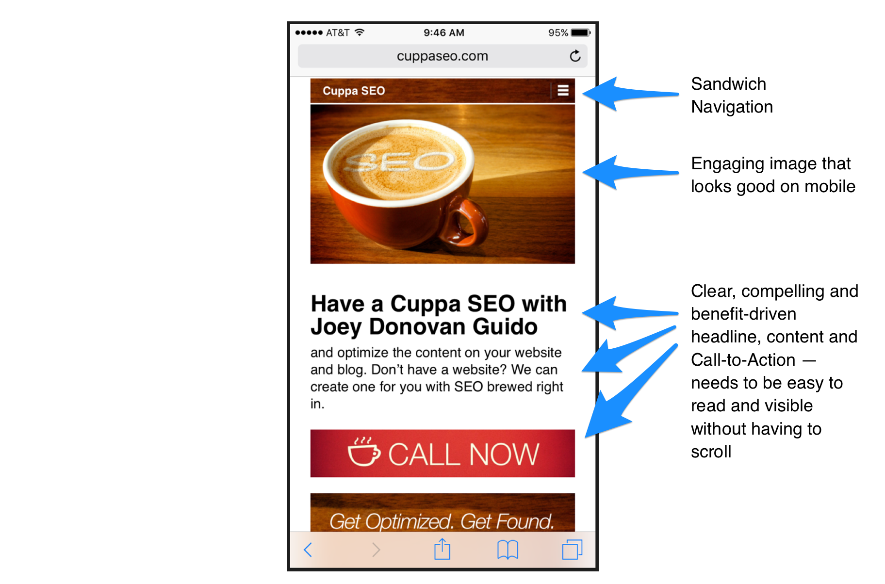
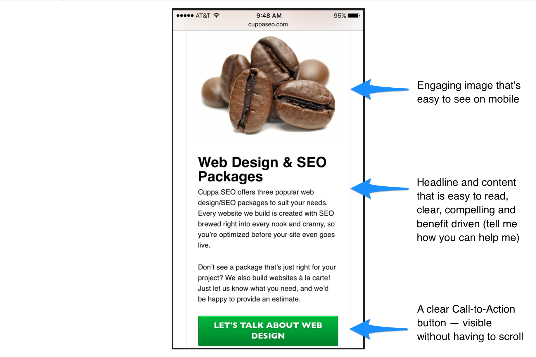
Mobile Homepage
Here are a few UX best practices for a mobile homepage:
Subpages
Just like your homepage, subpages need to be clear and uncluttered. Once again, Dollar Shave Club gives us a good example. You know exactly where you are and what your options are — without having to think about it. Three call-to-actions (my suggested maximum for any web page) make it easy to choose the blade that’s right for your beard, and move on. The fact that the page looks appealing is also important.
Mobile Subpages
Some examples of what goes into building a mobile subpage with solid UX:
We hope these best practices help improve the user experience on your website!
Want to learn more?
Sign up for our complimentary Holistic Approach to Online Marketing webinar.
You can also read our article, Ultimate User Experience (UX): The Dollar Shave Club.
Check out other articles in the series:
– Understanding Online Marketing, Part 1: Your Website