 When it comes to website design, conversion (CV) is an important part of any organization’s long-term success. But it’s not something that’s well understood.
In this article, we’ll answer the question, “what is conversion,” and discuss a handful of solid conversion strategies.
What is Conversion?
In order to better understand conversion, and the role it plays in your online marketing, let’s first take a look at what comes before conversion. In other words, what is the path a visitor might take to arrive at the point of conversion (POC)?
Well-developed search engine optimization (SEO) is how we get more visitors to our website. But getting more traffic to our website is not enough. It’s the beginning of a process that leads a visitor to the point of conversion. Once someone arrives on our website, it’s a solid user experience (UX) that keeps them there. And once we’ve got a visitor on our site, and they like that they see, it’s time for conversion …
In a nutshell, conversion is a strategy that takes a website visitor from where they are, to where you want them to go. Please note how I’ve worded this, “from where they are, to where you want them to go.”
For example, let’s say you’re a dental office and a potential new patient lands on your homepage. The next step you’d like them to take is to call you, which means your conversion strategy needs to be a call-to-action (CTA) that makes it easy for that potential new patient to call and make an appointment.
More often than not, your call-to-action will take the form of a button on your website.
How to Use It
This call-to-action button needs to be properly placed on both your desktop and mobile site, respectively. The reason for this is because of the differential in screen size between a laptop or desktop computer vs. a mobile phone or tablet. Different-sized screens call for different solutions, which often go beyond simple responsive design.
On a laptop, or even a tablet, a call-to-action may work very well placed on the hero shot (main image at the top of the page). On an iPhone, that same CTA needs to go somewhere different to be effective — not to mention remain readable for a good user experience.
In the following example, we’re using two CTAs on the homepage for Roger Wolkoff’s website. Roger is a professional speaker, and he’s also one of our clients.
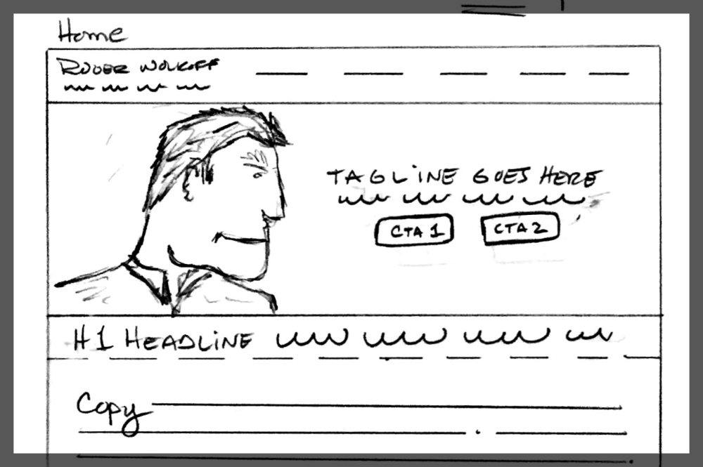
- CTA1, the most important call-to-action for this client, “Book Roger,” is the number one action Roger would like a potential client to take. This button is for visitors who are ready to hire Roger. Metaphorically, this potential client is ready for a first date. They probably already know Roger, or have been referred to him (he’s awesome, BTW). Regardless, they’re ready to discuss booking him as a professional speaker for an event.
- CTA 2, the second call-to-action, “Watch Roger Speak,” is almost as important as the first — but it serves a different purpose. This CTA is for visitors who are not ready for that first date yet. They need an introduction, “hi my name is Roger and this is who I am,” before committing to go out for dinner. In other words, CTA 2 is there for those who are not yet ready to commit to booking Roger, but want to learn more.
Those same CTAs on mobile serve the same purpose, but need completely different placement to remain effective:
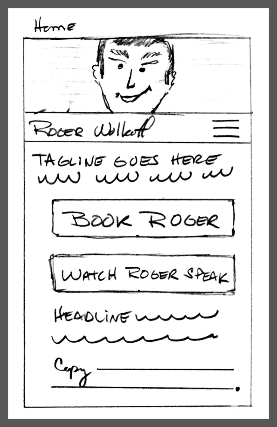
Now CTA1 and CTA2 have become buttons that sit below Roger’s hero shot and tagline. Easy to spot, easy to read — and easy to understand. That’s a recipe for great conversion and an excellent UX!
Speaking of UX, in both of these examples, there are a lot of user experience strategies going on that we won’t review here. But if you’d like to learn more about UX, feel free to click on the UX Categories section on the right for more articles on the subject.
As you can see from the examples above, there should never be anything random or non-critical about where your conversion strategy leads someone. This means you have to be crystal clear about the intention of your conversion strategy. In other words, if you’re that dental office looking to encourage more people to call and make an appointment, don’t make the mistake of offering a free e-book as your CTA.
I hope this helps give you a better understanding of website conversion!