 In this installment of our Understanding Online Marketing series, we’ll be focusing on conversion — for your home page and subpages.
Since this term may not be familiar to you, let’s start off with a brief definition.
What is Conversion?
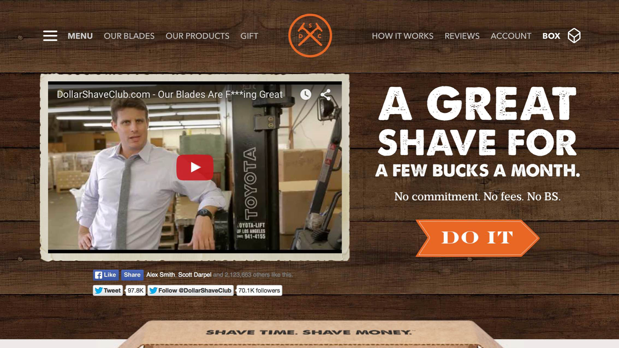
Conversion is a strategy that takes a website visitor from where they are, to where you want them to go. For example, a visitor lands on your homepage, and the next step you’d like them to take is to call you. Or, as in the Dollar Shave Club example below, if you’re selling a product the next desired step might be for the visitor to make a purchase.
How Do We Do This?
More often than not, the way we can encourage these next steps is through the use of a call-to-action (CTA), which usually takes the form of a button.
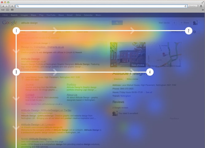 For desktop sites, the optimal area to place a CTA button is somewhere within the “F-Zone,” which is where the human eye is naturally drawn on a web page. But as we saw in our recent article, Web Design & the Art of Conversion, this doesn’t always have to be the case.
Here are some examples of a solid conversion strategy for desktop and mobile homepages and subpages …
Desktop Homepage Conversion
In this example, Dollar Shave Club serves up a beautiful call-to-action. Just a few words clarify what the potential customer can expect. This is followed by a clear, easy to find button that says, “Do It.”
It’s interesting to note that in this case, the CTA button is NOT in the F-Zone … but the big, fat headline is. This headline, subhead and six words of copy all direct the eye to the call-to-action.
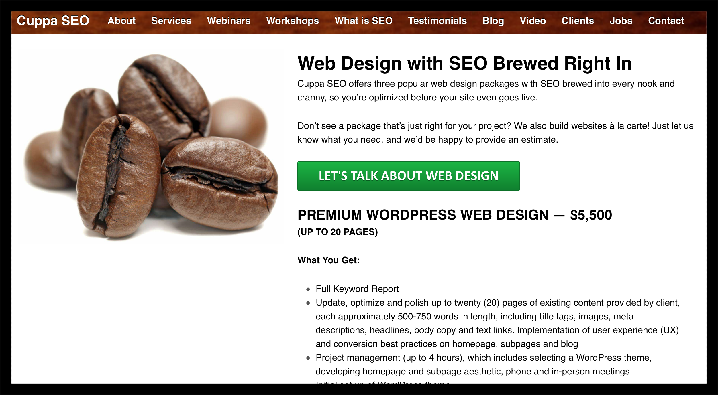
Desktop Subpage Conversion
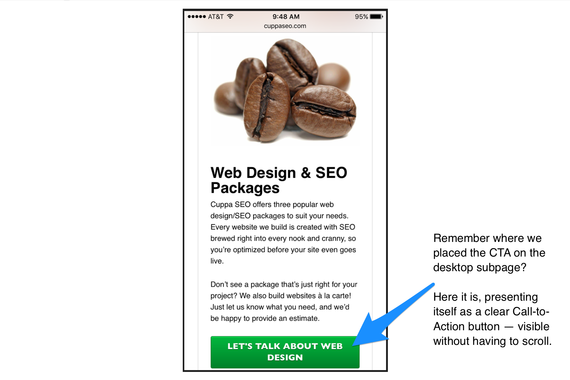
In this subpage example, the button sits near the top of the page, within the F-zone. In addition to placing this button within a highly visible area, there are other benefits:
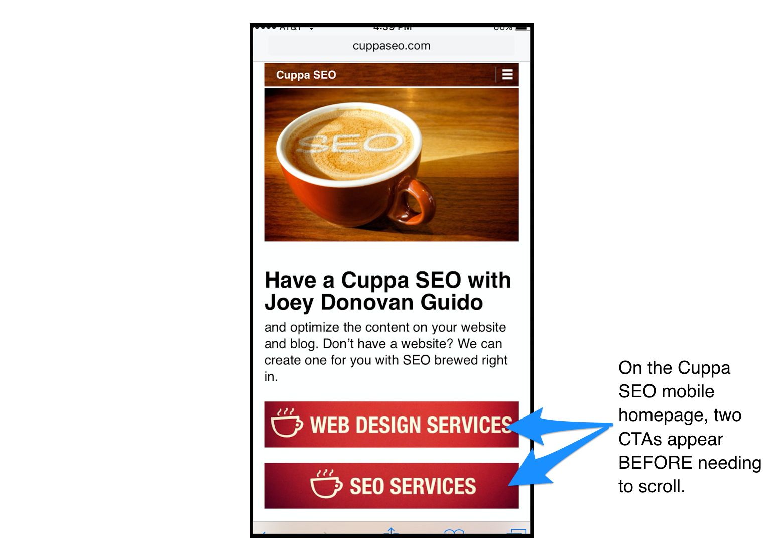
- It’s a good User Experience. If the user is ready to get in touch with Cuppa SEO, I’ve just made it incredibly easy for them.
- This button placement also translates well into mobile design best practices, so the hierarchy of the subpage can remain intact for a cohesive brand experience.
Mobile Homepage
Mobile Subpage
We hope these best practices help improve the conversion on your website!
Want to learn more?
Sign up for our complimentary Holistic Approach to Online Marketing webinar.
Check out other articles in the series:
– Understanding Online Marketing, Part 1: Your Website
– Understanding Online Marketing, Part 2: User Experience (UX)