 Talk about mobile web design, and being mobile friendly, has increased dramatically since Google started grading sites based on their “mobile-friendly factor.”
But mobile-friendly web design has been an important consideration since the very first iPhone allowed a person to search the internet in the palm of their hand.
Why? Because no matter what device you’re using — iPhone, iPad, laptop, or desktop computer — you’ve go to provide a good user experience (UX).
What is User Experience?
In a nutshell, UX is exactly what it sounds like: a positive, negative or indifferent experience a visitor has with something.
There are two main types of UX:
- Analog User Experience: experiences you have in the real world — like a restaurant, supermarket, the gas station, etc.
- Digital User Experience: experiences that occur, as you might have guessed, online
In the case of a mobile website, when the UX is good, a visitor will stick around, and actually look forward to coming back to your site. And when it’s bad, they will hit the back button, never to return.
To follow are 5 mobile web design tips that provide a better user experience — and make your site extremely mobile friendly, too! As our example, we’re using the Cuppa SEO homepage …
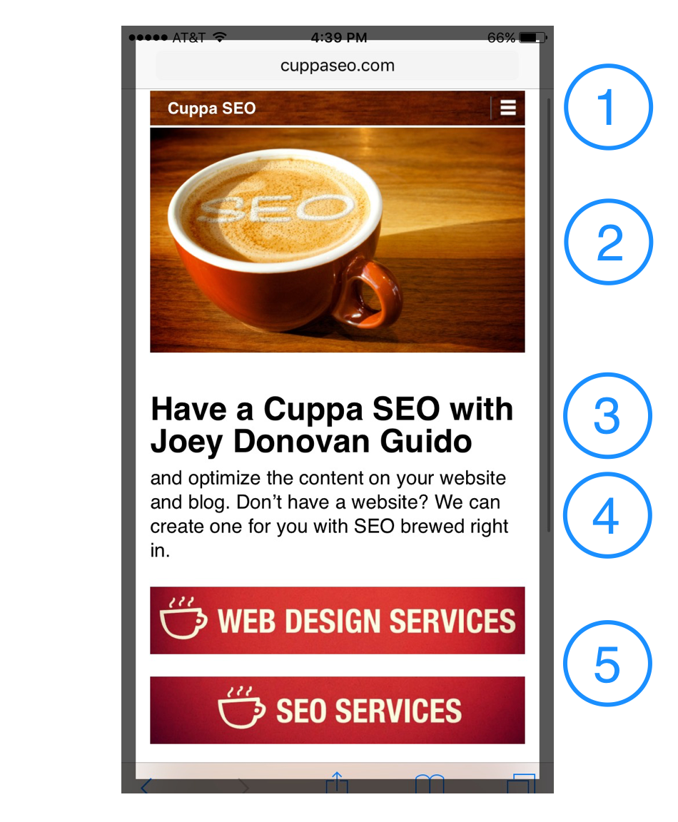 Sandwich Navigation: those three bars you see in the upper right hand corner are typically referred to as sandwich navigation. They’re your entire navigation collapsed into three little lines. This is the optimal way to present your mobile navigation. Once the sandwich is clicked, the navigation expands and allows the viewer to choose from the full menu. Sandwich navigation typically sits above or below the hero shot (top image) on a page.
- The Hero Shot: this is the main image on your mobile page. It needs to be clean, clear and clutter-free — since it has to be understood on a much smaller screen. For this reason, any calls-to-action (CTAs) you have on your desktop hero shot need to be removed for mobile. As you’ll soon see, they go somewhere else.
- Headline: the main headline on any web page is called your “H1.” It’s the largest headline on the page, and it should live toward the top. Whenever possible, limit your headline to 2 lines of copy. This keeps it easy to digest, and gives you more room for #4 and #5 on our list.
- Introductory Copy: the first couple of sentences of copy needs to live here. You DON’T need to provide every little detail … at least not yet. Intro copy is meant to be just that — a brief overview of where the viewer has landed so they feel they have solid footing. This copy needs to be a large enough font for those of us with older eyes (or transition lenses) to easily read. Writers don’t dismay! The remainder of your homepage (or subpage) copy is still included for mobile websites. It will just live below your …
- Call-to-Action (CTA): in Cuppa SEO’s case, we have two CTAs we want to share with visitors on the homepage: Web Design Services and SEO Services. In many cases, your business may only need one call-to-action. In all cases, your CTA should drive visitors to what you want them to do next (so choose wisely). As you can see, both of my CTAs live ABOVE the scroll line, which means the viewer does not have to scroll down to see them.
All of this adds up to a user experience that viewers enjoy, and that Google defines as extremely mobile friendly.
Next Steps
If you have a website, I encourage you to take a look at it on your smart phone to see if it’s following the best practices laid out above. If not, make the necessary changes. If you need help with the process, feel free to contact Cuppa SEO — we’re always happy to help!
For More About UX
Check our our article, Understanding Online Marketing, Part 2: User Experience