 We all face trade-offs in our professional and personal lives.
When we choose to stop working and spend time with family or friends, it’s a trade-off. When we decide to stay up an extra two hours to get that work done, instead of going to sleep, it’s a trade off.
In each instance, we’re choosing one thing over another, which is why figuring out which is most essential in life, and in business, is so important. If we trade-off something really important for something that’s less important — but begging for our attention — that can have long-lasting repercussions.
In his book, Essentialism, Greg McKeown talks about the “reality of trade-offs: we can’t have it all or do it all. If we could, there would be no reason to evaluate or eliminate options.” I agree.
Greg goes on to say, “Once we accept the reality of trade-offs we stop asking how can I make it all work, and start asking the more honest question which problem do I want to solve?’”
What this Has to Do with Your Website
How about EVERYTHING?
Your website is a lot like your personal and professional life — it can’t do everything. And yet, many businesses and web design firms try and make it do just that with strategies like:
- Multiple navigations
- Social media buttons front-and-center on the homepage
- An egregious amount of calls-to-action
- Pop Ups
- Carousels (Sliders)
- A website that’s over designed, as opposed to designed for a stellar user experience (UX)
I’m not saying every website possesses all of these attributes, but a high percentage of sites contain one or more of them.
Why? Because not enough trade-offs were made — or more specifically, trade-offs were made (intentionally or unintentionally) in favor of the non-essential. Bad for your website, and bad for your business.
The most successful trade-offs are deliberate and well thought out.
Let’s evaluate each of the four web design strategies mentioned above and how we can make more essential trade-offs for each …
MULTIPLE NAVIGATIONS
Typically, multiple navigation bars, or primary and secondary navigation bars can be tricky and difficult for the user to navigate — which means a bad user experience.
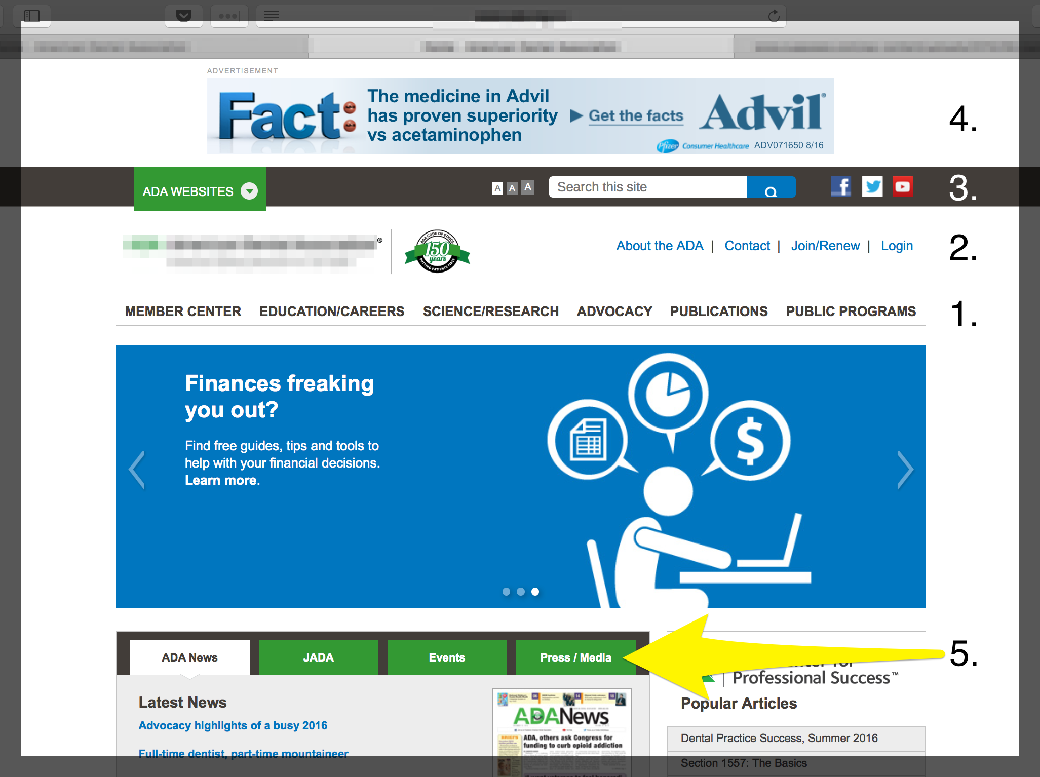
Let’s take a look at a site with multi-navigation hierarchies that can create a poor UX for a visitor …
Navigation #1 & 2
In the above example, #1 is the primary navigation. Then you’ve got a secondary nav above it.
Already, the user’s focus is split in two — at least for a few seconds, which can be enough to confuse or distract someone. Not the desired effect.
Navigation #3
But this website isn’t done yet. The third navigation (#3) sits above the secondary nav. This is the search box and social buttons. We’ll talk about this next in the Social Media Icons section.
Navigation #4
Nav #4 is an advertisement for Advil. And although it’s not technically part of the navigation (it’s a call-to-action), I’m counting it here because it is taking up prime real estate where your primary navigation should be!
Navigation #5
This navigation sits mid-page, disjointed from the primary navigation. Nav #5 contains news-centric information. Something that could easily be communicated through adding “News” to the primary nav, along with a dropdown menu to accommodate each tab.
At this point, the visitor’s focus has potentially been split five times — and that’s not even counting the slider they use for multiple hero images (bad for UX) and the other links and call-to-actions on the page.
SOCIAL MEDIA ICONS (NAVIGATION #3)
It’s typically a bad idea to place social buttons at the top of a web page like this for two reasons:
- Social buttons add another layer of navigation to the site. Now the user’s focus is split into three. What is the purpose of those social buttons? To bring someone to one of your social media platforms, right? As we’ll see in Part 4 of this book, social media — very often — is a tool that helps drive people TO YOUR WEBSITE.
- When you place your social buttons right up at the top of your page, in addition to competing with your primary navigation — it also runs the risk of directing someone AWAY from your website.
When this happens, you’re directing traffic the wrong way! Once we’ve got someone on our website, the last thing we want to do is have them leave! More on this in Part 4, but I wanted to address, albeit briefly here, too.
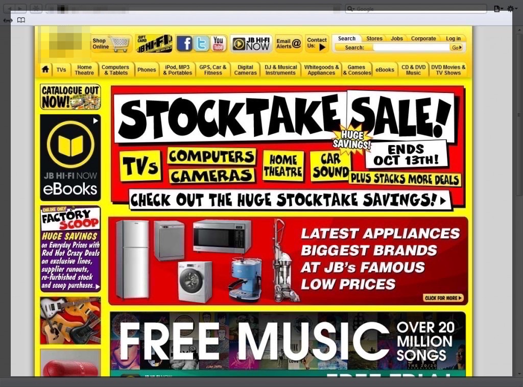
MULTIPLE CALLS-TO-ACTION
To achieve high conversion on your website, your call-to-action needs to be clear. Notice that I said “call-to-action,” not “calls-to-action.” Too often, websites offer way too many calls-to-action to customers (bad for UX), when they should only be providing one or two. Lucky’s menu is the perfect metaphorical example of a successful call to action. It’s clear, easy to understand and it wasn’t 16 pages long like the menus we’ve all had to fumble through at a diner.
When we offer only one or two calls-to-action, we wind up providing a better user experience, and in turn have a greater chance of having the customer take action.
In other words, avoid this …
POP UPS
Pop ups are poor for UX because they’re an interruption from what people came to your site for. Plus, they make a visitor have to stop and think about what the pop up says, and if it’s relevant or not to them. In other words, it adds another layer of thinking and decision making to the process — which breaks the “don’t make me think” rule.
And they’re annoying.
Yes, pop ups provoke visitors to feel annoyed. Why would you want to intentionally annoy visitors when you’re trying to convert them into customers? There are better ways to engage.
CAROUSELS (SLIDE SHOWS)
Website carousels, also referred to as slideshows or rotating offers, are something we find on a lot of websites. But they’re a bad user experience and they’re bad for conversion.
As an organization, it’s always tempting to give MORE information on one’s website. But more information can often have the opposite effect of what was intended.
Carousels make your visitor think harder. Every new rotating banner is new information that makes the viewer have to think, and even if that’s for only a few seconds, that’s a few seconds too many.
Yes, you should assume your customers are intelligent, and yes — you should also acknowledge they’re overwhelmed and super busy. As every new offer slides into view, you’re giving them more work to do. They’ve got to digest it, then decide if it’s more important to them than the previous offer(s). And then, after four slides, they’re asking “what was the first one again,” and possibly wondering how they get back to a previous offer.
Instead of carousels, use a single image for better UX. Then, figure out the top one to three (maximum) things your visitor needs (address those pain points) and make them easy to find calls-to-action.
OVERDESIGN
 The following type of site is often a lot of fun for a designer to build, as it provides opportunity to be really creative. But it’s bad for UX because it’s really hard for the visitor to easily locate the exact information they need. The type of site in our example is called a parallax site, but there are many over-designed sites that aren’t parallax that still have moving backgrounds, and animations that pop onto the screen from out of no where.
Sites like this can be very unsettling for the viewer who’s looking for “solid footing” as soon as they arrive on your site. What I mean by this is that website visitors, mostly unconsciously, have a need to understand the lay of the land when they arrive on a website. They want to feel grounded, and be able to quickly understand where they are without having to think about it.
I hope these examples help you trade-off non-essentials for essentials on your website!
Need some help?
If you’re looking to make improvements like this on your site, but need some assistance, feel free to contact Cuppa SEO anytime. We’d be happy to discuss how we can help improve your web design.
Want more tips and insights from Cuppa SEO?


