 Not all design is good design — especially if it forsakes function for aesthetic.
Although we’re talking about website design here, I’d like to take a step back and share a real-world experience that shows how choosing form over function can cause a poor user experience — and ultimately make a product unusable, or at the least non-optimal for the end user.
Choosing Design Over Functionality: a Mini Case Study
I recently upgraded my iPhone and purchased a case to protect it.
The design of the case was beautiful, complete with wood inlay art on the back.
Regarding function, the online description of the case promised a “raised bezel” for screen protection. Since protection was an attribute I was looking for, I bought the case.
The Problem
Upon placing the case on my phone, I noticed there was NO raised bezel to protect the phone’s screen, and that putting the phone face down exposed the screen directly to whatever surface it was placed upon.
What’s happened here is two major things …
My expectations weren’t met, and they should have been based on product specs. This raises the issue of delivering what you promise, which we won’t dive deeply into here (maybe in a another post).
The other issue is the fact that the company that makes these cases chose form over function.
In a tech world where Jonny Ive (Apple’s long-time product designer) strives for an ever-slimmer aesthetic, case makers have followed suit to make cases ultra thin. What the fascination with thin is, I don’t personally understand, especially when a slightly thicker iPhone would make the back of the phone FLAT, as opposed to having a camera protrusion, which would be a better design — and a better user experience — for all of us iPhone users.
Regarding the case in question, the problem is the MAIN function of a case is to protect your phone, and removing a protective component to add a few less millimeters of thickness defeats the purpose of the product.
In this case (pun intended) the manufacturer of this case, and many other cases I’ve researched, are all choosing form over function — which means they’ve gotten it all wrong.
Good design is design that holds functionality at the forefront, allowing the design to SUPPORT functionality, and actually make the product more intuitive to use. Think Mac vs. PC (sorry Microsoft, but it’s true).
What This Has to Do With Your Website Design
When a visitor arrives on your website, they typically have a specific reason: to attain information, buy a product or service, schedule an appointment, etc.
The function of your website is to make it as easy as possible for a website visitor to take the action YOU WANT THEM TO TAKE NEXT, which means you need to make it as easy as possible for the visitor to understand what you offer and if it solves their problem (what I often refer to as a pain point).
If the design of your website supports this philosophy, that’s great! It’s also following a solid, proven user experience and conversion methodology.
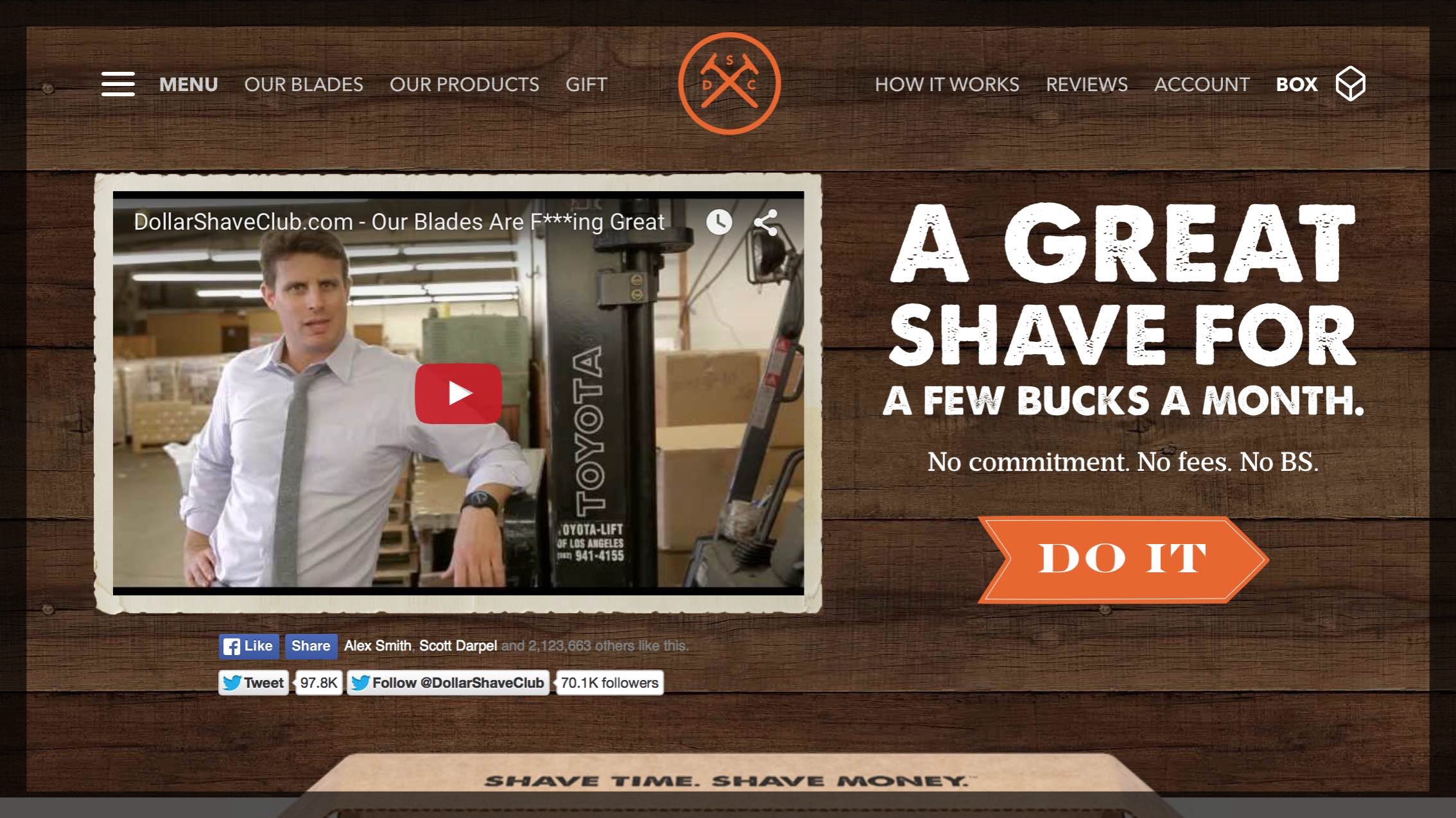
For example, the Cuppa SEO website homepage provides brief descriptive copy that lets you know exactly how we can help, followed by two (and only two) calls-to-action that lead the viewer to where they want to go. No distraction, no confusion.

Here’s another example of a homepage where function is fully supported by design:
On the other hand, if the design of your website looks like this, offering you’re in trouble …
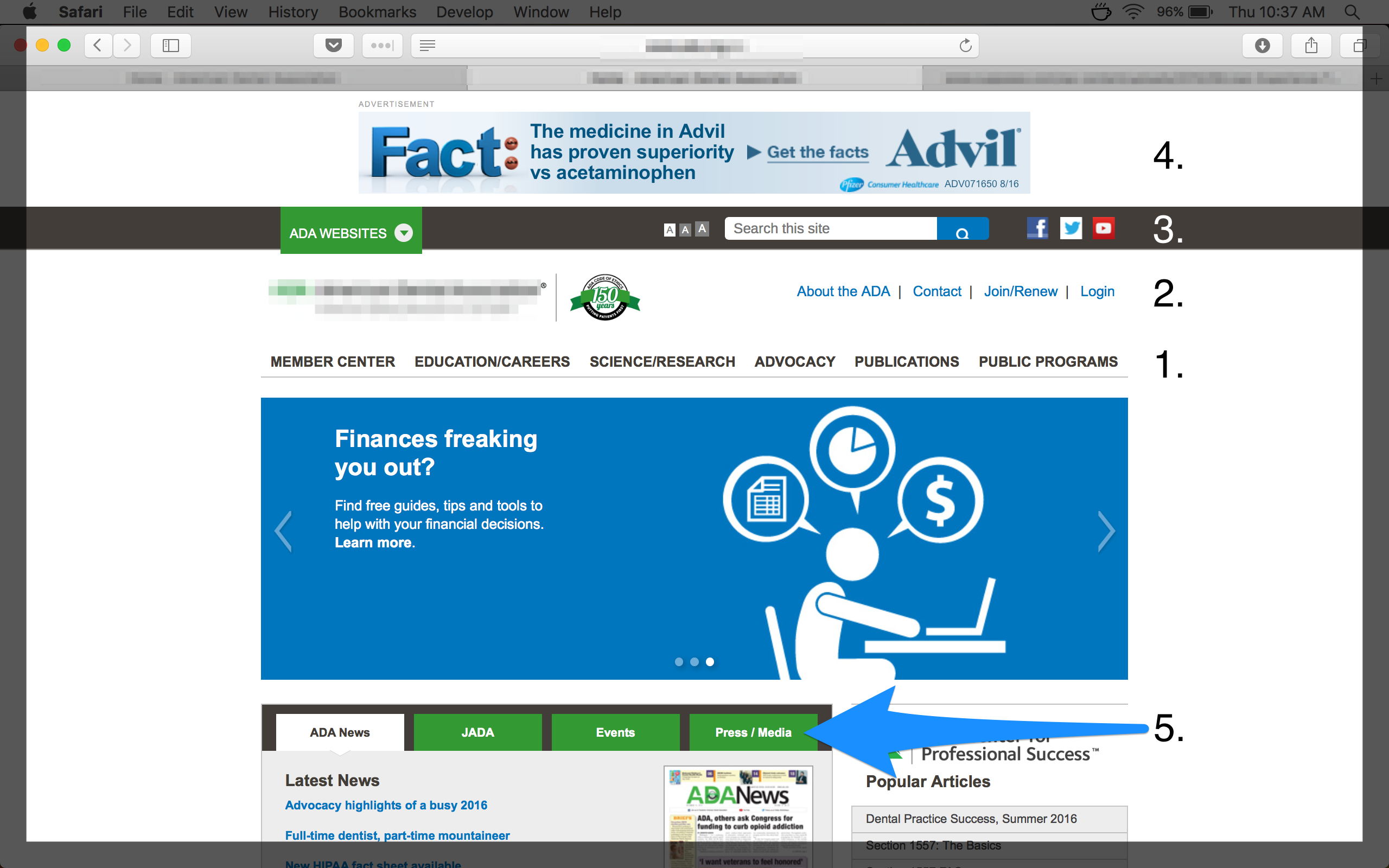
As you can see, it has no less than FIVE navigations (I’ve counted the ad at the top of the page as a navigation element as this is prime real estate, and typically where your navigation should live). This homepage also offers no clear conversion strategy.
The result? I’m left with not really knowing where I am, what I’m looking at or what to do next. The desire to design this website without placing functionality at the forefront has created confusion — which is a bad user experience.
Want more info about this topic and others like it?
Check out my book, A Holistic Guide to Online Marketing.