 Website carousels, also referred to as slideshows or rotating offers, are something we find on a lot of websites. But they’re a bad user experience and they’re bad for conversion.
As an organization, it’s always tempting to give MORE information on one’s website. But more information can often have the opposite effect of what was intended.
Carousels make your visitor think harder. Every new rotating banner is new information that makes the viewer have to think, and even if that’s for only a few seconds, that’s a few seconds too many.
Yes, you should assume your customers are intelligent, and yes — you should also acknowledge they’re overwhelmed and super busy. As every new offer slides into view, you’re giving them more work to do. They’ve got to digest it, then decide if it’s more important to them than the previous offer(s). And then, after four slides, they’re asking “what was the first one again,” and possibly wondering how they get back to a previous offer.
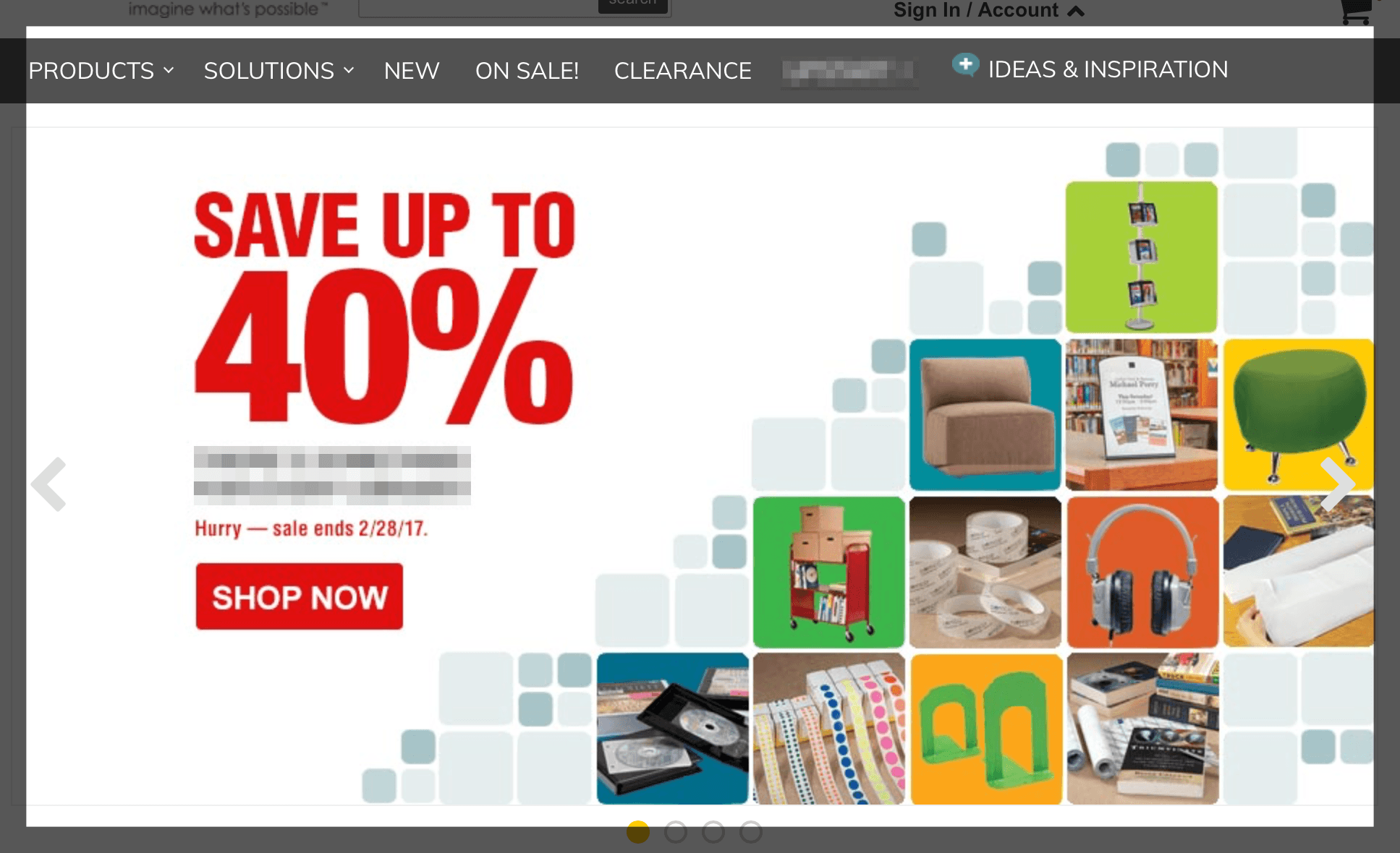
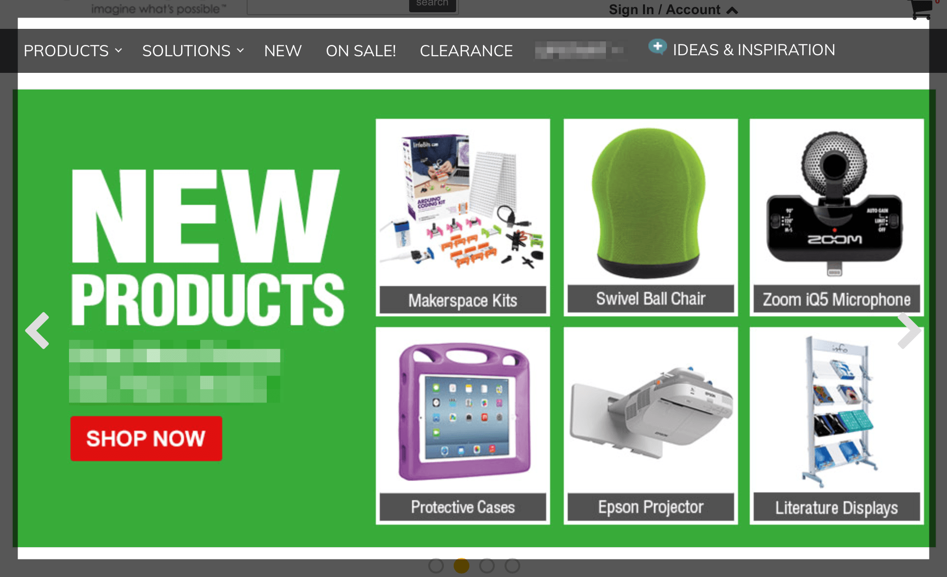
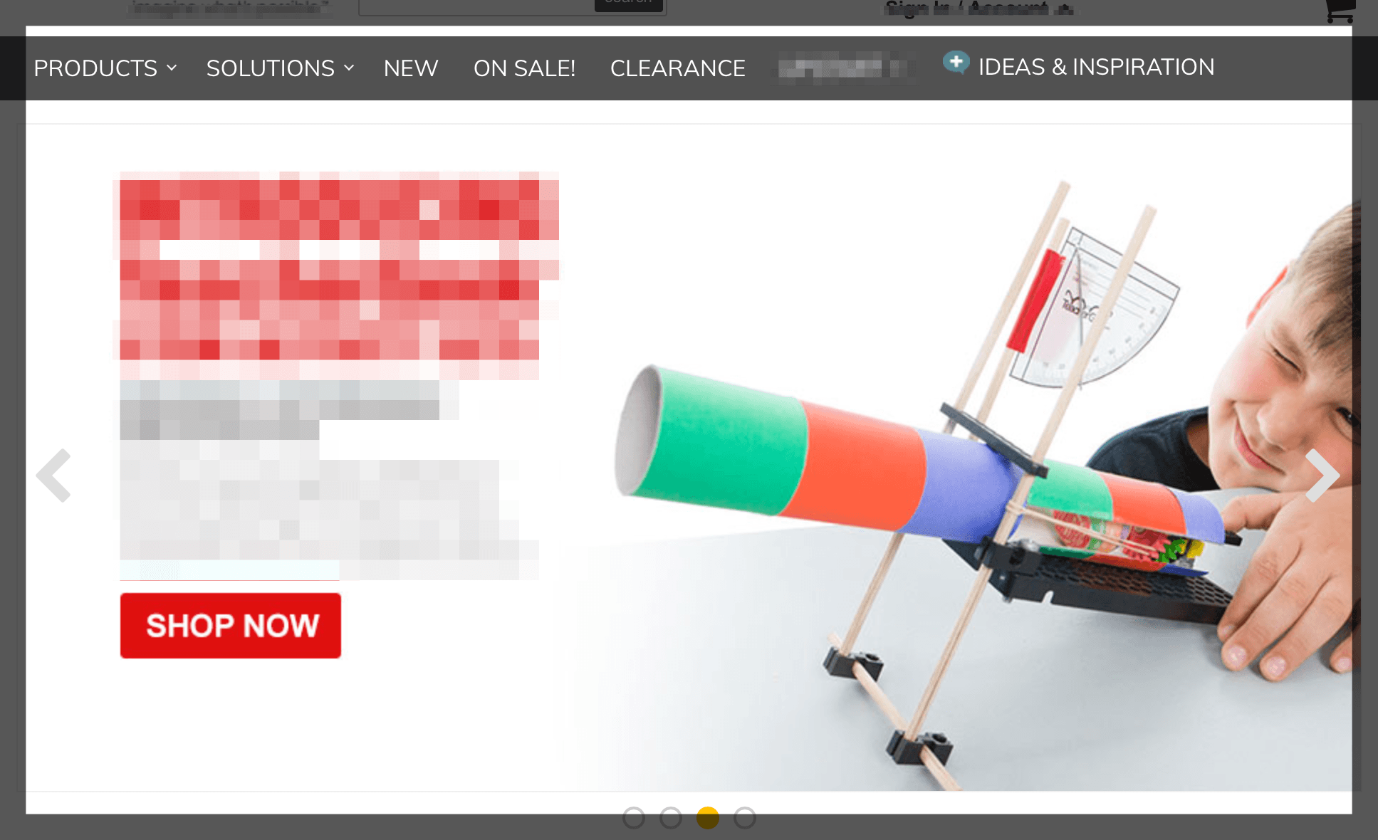
Here’s an example of a website that presents a carousel of four offers on their homepage:

Instead of this plethora of information, your homepage hero image — and accompanying content and call-to-action (CTA) — should be like a very clear sign:
- “You are here”
- “Here’s how we can help”
- “Do this next if you want to talk”
Instead of carousels, use a single image for better UX. Then, figure out the top one to three (maximum) things your visitor needs (address those pain points) and make them easy to find calls-to-action.
Good CTAs provide the right offers (client pain points that become your points of conversion), that are easy to find (which equals a good user experience), resulting in a more successful website. This “formula” often leads to increased qualified leads and decreased unqualified leads.

YES! I totally agree. I ONLY like carousels when I have the option of manually looking through all of them. Usually carousels show me the offers I’m interested in.. and I hate waiting to see an image again in case I didn’t read all the info the first time around.