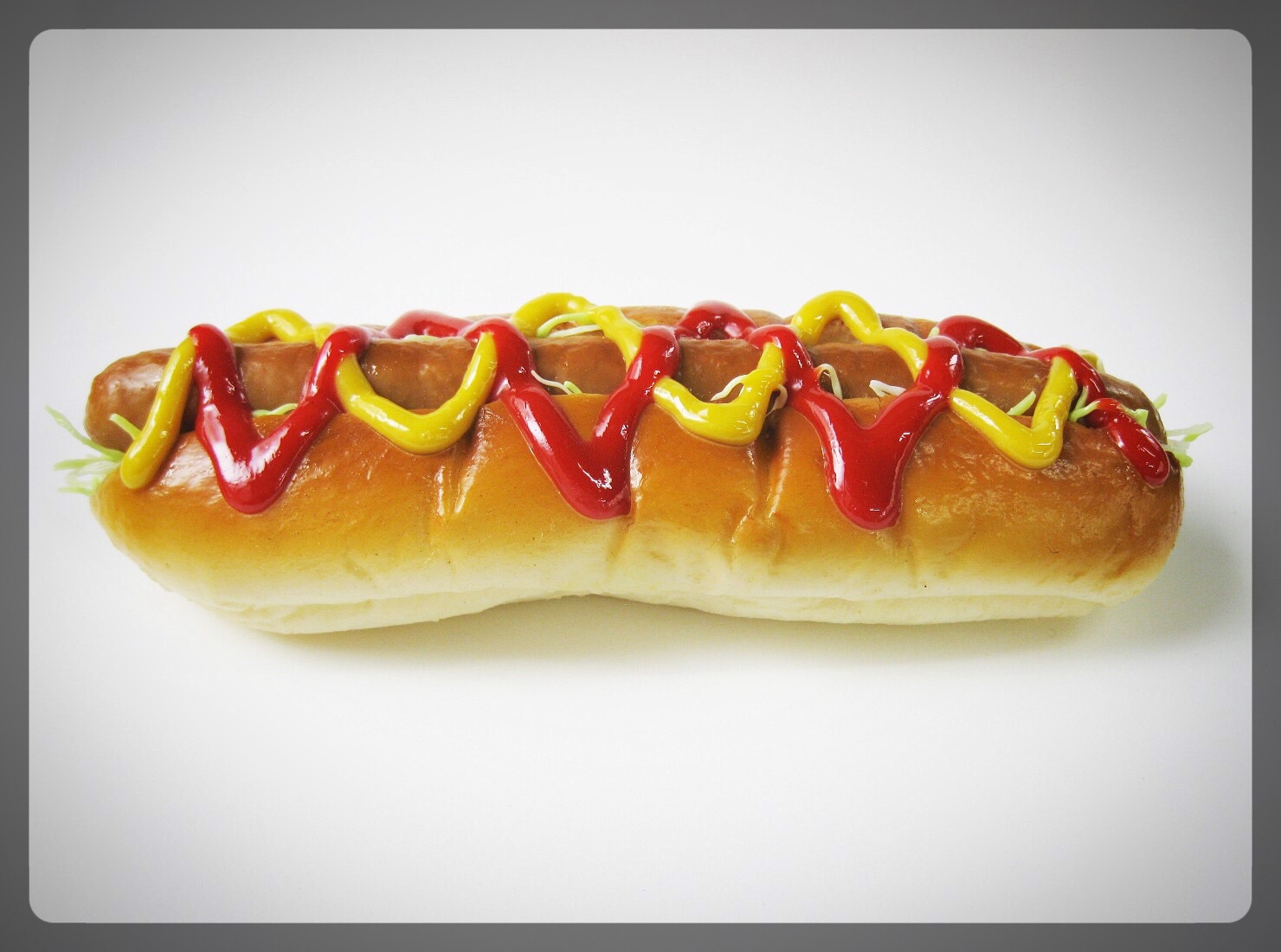
 What happened to the eighth hot dog?
This was a question I wound up asking myself during my last shopping excursion.
When I went to pick up a package of hot dogs, I noticed that there were only seven. Inspecting a few other brands, I noticed the same.
This may sound like a trivial observation, but when you’re part of a family of four (plus our pesky cat), you’re kind of depending on having two hot dogs per person.
Somebody had to decide to make this change — but why?
Did customer feedback tell a tale of one too many hot dogs? Or, did the price of producing hot dogs go up (at least for the more premium offerings), causing these companies to cut out some of the product instead of increasing the price? Or was there simply a desire for more profit per pack?
No matter the reason, my user experience (UX) was poor. And I can’t be the only one.
The reason why I’m talking about it here is because this analog user experience raises a question that is relevant to web design and your website.
How this Relates to Your Website & Your Business
Addressing Customer Needs
Are you addressing your customers’ needs with your products and services? Or are you trying to fit them into a box that’s convenient for you? A great example of this is the Apple Watch, which limits your band colors to how Apple wants to pair them up. Using the Sport model as an example, if you want a black watch with a black band, no problem. If you want a silver watch with a black band (a popular and classic combo), you’re out of luck. But you can pay $50 and get a black band as an accessory. This is good for Apple, and their bottom line, but bad for their customer’s UX.
Are You Addressing Integrations?
These days, it’s becoming more and more easy to integrate apps on our computers and mobile devices. Companies like WordPress, Slack, Meister Task, Mail Chimp an many others understand that their customers have a need for apps created by different vendors to work together. In the case of the missing hot dog, how does a 7-pack of franks work with my 8-pack of buns? It used to work seamlessly, but now there’s a gap. And that gap means lost money to the customer. In this case, you’re now paying for an extra bun. Plus you’re still paying for eight hot dogs, which means the value proposition of the product has actually gone down.
The Role of Packaging
Just like hot dogs, your website is packaged. The way it looks and functions makes a difference. If you’ve got a site that’s non-responsive and non-mobile friendly, both Google and your visitors are going to notice.
A good analogy here is the blister pack. Remember those? The plastic packages that are near impossible to open without inflicting bodily injury? Don’t let your website be a blister pack. Make it responsive and mobile friendly. Even better, make it easy to use with a clear navigational hierarchy — and make it attractive!
Once you’ve done all this, don’t make the visitor think (another UX best practice) about what they need to do next. Give them a clear, compelling call-to-action — most likely a button — toward the top of the page so it’s easy to take the next step. Now, instead of a blister pack, your website is a well designed, easy-open package.
At first glance, these may seem like trivial things to focus on. But they’re not. Every single piece of your product, service, or web design moves someone toward a positive or negative user experience. One “little” problem may be the tipping point that makes someone disengage.
I hope these user experience tips help!