 I don’t know about you, but I’ve never had anyone I know say they liked pop ups. Not one.
This comes as no surprise, as pop ups on a website are a poor user experience (UX), and can also diminish conversion rates for the things that really matter (selling products and services).
According to my son, Joss, “ pop ups are like whac-a-moles — you just want to smash them.” I couldn’t agree more (I think we’ve got a UX expert in the making here).
Pop ups are poor for UX because they’re an interruption from what people came to your site for. Plus, they make a visitor have to stop and think about what the pop up says, and if it’s relevant or not to them. In other words, it adds another layer of thinking and decision making to the process — which breaks the “don’t make me think” rule.
And they’re annoying.
Yes, pop ups provoke visitors to feel annoyed. Why would you want to intentionally annoy visitors when you’re trying to convert them into customers? There are better ways to engage.
For instance, if the offer in your pop up is so important, why isn’t it one of your calls-to-action on your homepage? If it needs to be present beyond the homepage, consider more UX-friendly ways to integrate it into the page hierarchy. In other words, build it into an organic place where people can find it easily without it being thrown in their face.
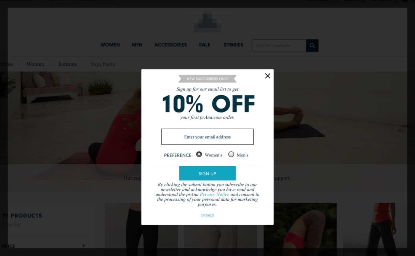
Here’s a perfect example. I was recently buying a gift for my wife’s birthday. She’s a yoga enthusiast, so I decided to get her some new yoga pants and tops. Literally every site I went on had a pop up with the same message … “save 10% by signing up for our email list.”
What’s more important, the email list or making a sale?
If I make a purchase, couldn’t you ask me if I want special offers, news and discounts then — after I’ve checked out and become a paying customer? Why do you have to ask me within the first three seconds I show up on your site — especially when your number one conversion goal is to make a sale?
At the end of the day, a pop up is like any other strategy on your website … it needs to be thought through carefully to ensure it has the potential to accomplish your major goals — make a sale, schedule a consultation, etc. If it’s not in direct alignment with your major goals, then get rid of it, or figure out a way to include it as a secondary goal that’s a good UX (like we did with the yoga pants example above when we added the email sign up to the end of the experience).
Even if it is in alignment with your major goals, the questions remains: “is this pop up the best way to communicate with the visitor?” If it is (it’s probably not), when exactly is the best time to present it so it’s a good UX an not a stopper from building a relationship?
When Chris Goward, a leading expert on conversion optimization, talks about pop ups he agrees they can interrupt the visitor’s experience … “Any distraction can reduce sales — especially something totally unrelated to the goal of the visit.”
Want more tips and insights from Cuppa SEO?