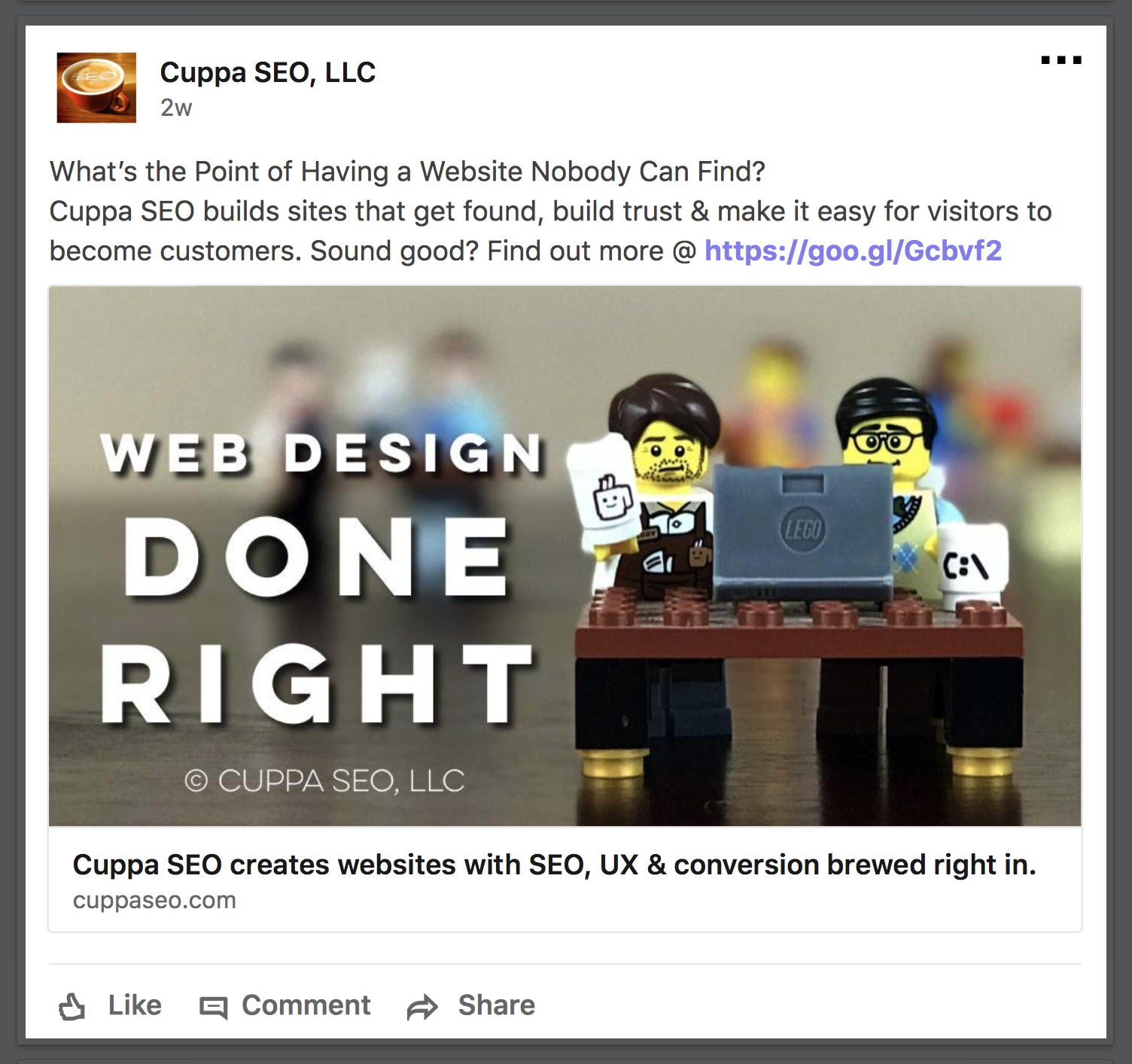
The image above is an example of what a well-constructed LinkedIn post looks like …Let’s dissect it to give insight as to how this post is using SEO, user experience and conversion.
Note:This same methodology can be implemented in your LinkedIn personal profile or business page. It’s just a matter of where you feel your post will have the most impact. For my business, I have many more connections on my personal profile page, so I post there and then simply share to my Cuppa SEO business page …
TITLE (HEADLINE)
What’s the Point of Having a Website Nobody Can Find?
The clear, emotionally engaging title is meant to connect with business owners who are frustrated because their website is not getting found — in other words, their sites are not generating enough traffic.
SEO: Whenever possible, I like to include a keyword phrase in the title of my LinkedIn Company Page posts. As you can see, this is NOT the case here. I always like to say, “Never sacrifice the quality of your content for the sake of SEO. Search engine optimization needs to support your content, not weaken it.”
Here, the emotional engagement I was looking for was paramount, which goes to show there is no one-size-fits-all solution for social media (or anything else, for that matter). Always take a moment to think about what your intention (or goal) is for every single post you publish, and then follow through on that intention.
UX: The title is clear, especially to those who are having problems with website traffic — and those are the folks we want to connect with. The title also offers a good UX to this demographic, because it shows understanding of a serious problem they’re experiencing. If people reading the post fit into this category, they might be feeling hurt (even betrayed) by their previous web developer who charged them a premium price for a sub-par website that isn’t performing.
The title is further clarified by the brief copy and imagery that follows it.
Conversion: As you might have guessed, conversion doesn’t come directly into play in the title. BUT, if the title didn’t have a good UX — say it was really long, ambiguous or didn’t have an emotional tug — you’d have less chance of someone reviewing the rest of the post and clicking on your link. That’s why I consider the title a “soft conversion,” or a conversion leader.
BRIEF CONTENT
Under our headline, the copy reads:
Cuppa SEO builds sites that get found, build trust & make it easy for visitors to become customers. Sound good? Find out more @ https://lnkd.in/eqrSePy
SEO: Except for “SEO” our copy doesn’t have keywords in it. And that’s OK, because once again I am trying to engage with readers on an emotional level — and connect with them in terms they understand. So if you’re wondering why my example isn’t chock-full of keywords, that’s why. Your LinkedIn Company Page post content (and title for that matter) may not always be optimized with keywords. If this is the case, it’s OK — as long as it’s a choice and not an oversight.
I’ve done a lot of testing and research, and I’ve found that even my marketing- savvy clients don’t respond well to words like “SEO,” “user experience” and “conversion.” They respond well to knowing that I understand their problem, and that I know how to solve it! Thus, the copy here offers solutions to the problem addressed in the title — in plain English.
UX: As you might have guessed, this content is good for UX because it “pays off” the title and adds clarification. It’s also on the short side, which also provides a solid UX. The shorter the better — as long as you’re not sacrificing a clear, engaging message for brevity. As we mentioned in the Google My Business section, the content in your post is an appetizer — not a main course. It’s meant to entice and engage readers so they are eager to take the next step, which of course is …
Conversion: Once readers have taken the time to read our title and copy, we need to give them a clear, easy path to taking the next step we want them to take. In this case, it’s visiting Cuppa SEO’s Web Design page. In our example, this is accomplished with a shortened text link (LinkedIn automatically shortens text links in posts; you don’t have to worry about it).
A note on content and text links …
These days, though, it’s totally OK to write your posts long form, as LinkedIn likes it when people stick around on their platform, and longer content (that’s relevant to the reader) can help accomplish this.
Another tip is to test out placing your text link in the first comment after publishing the post. This can GREATLY increase the amount of views.
Why? Because LinkedIn (and all other social media platforms for that matter) don’t like it when you leave their site. So, when they see a text link in your main message, there’s a good chance LinkedIn will present it to less people because it doesn’t want people leaving. Placing the link in the first comment is a loophole or sorts that still currently works … for now …
IMAGERY
It’s no surprise that imagery is a critical component of your LinkedIn Company Page posts, so let’s dive in …
SEO: The image is well optimized. The actual image name is: Cuppa-SEO- Madison-WI-Web-Design-UX-Services.jpg.
As we’ve discussed before, an optimized image makes your post easier to find on social media and in organic searches. Be sure to optimize your imagery as we outlined earlier in the book.
UX: Your picture/imagery is what I like to call your “stopper,” because it can literally stop viewers in their tracks while they’re scrolling through their Facebook feed. The picture is your instant UX meter — providing a positive, negative or neutral experience in the blink of an eye. If the image doesn’t cause a positive UX, the scrolling continues (which is why choosing or creating engaging imagery is so important).
Your imagery should always support your post’s headline and copy. When it does, the overall UX of your post rises. It’s all about creating a cohesive post so the reader doesn’t have to think about how the copy and the picture go together — because it’s obvious.
Conversion: If possible, make sure your imagery is clickable AND that it leads to the content you’re highlighting in your post. For example, when clicked, the imagery in our current example leads the reader directly to our Web Design page. But this does not happen by chance, so let’s discuss the process …
To have the imagery in my LinkedIn Company Page post to link directly to my Web Design page, the image first needs to live on my actual Web Design page. In other words, when I created the page, I needed to think ahead and use imagery that would also look good on social media. It needed to be sized correctly (so it fit well in within the parameters of my LinkedIn post), and have a clear message that made sense on my site as well as on social channels.
Once the imagery is on my Web Design page, when I add the link to my Web Design page into my LinkedIn post, LinkedIn automatically pulls the image into the post. Even better, that image is coded (by LinkedIn) to be a direct link to my Web Design page!
Now my image and my text link both drive people to the same place, which is a big plus for conversion (and for UX, too).
On the other hand, if you upload an image directly into your LinkedIn Company Page post (from somewhere like your desktop, Dropbox, or photo library), when clicked it won’t lead people to where you want them to go. Instead, it will only make the image bigger — which means you’ll potentially lose out on converting someone. Avoid this. Take the time to set things up right, if it’s possible to do so.
Want to learn more?
This post is an excerpt from my book, A Holistic Guide to Online Marketing, which contains many more tips to help you with your online marketing.
Thanks for visiting, and stay well!