 Which coffee packaging do you like best?
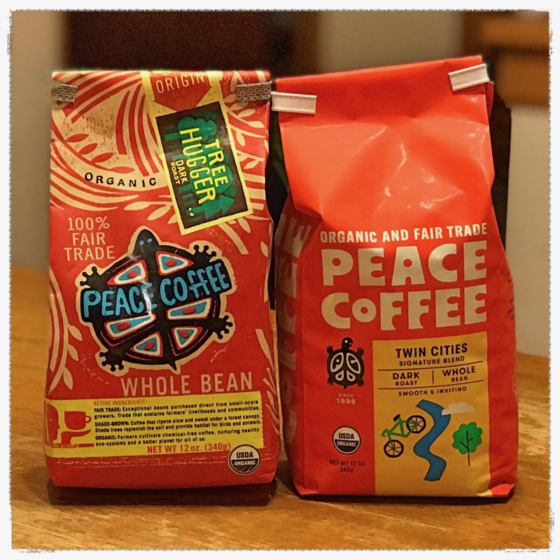
The one on the left is the former Peace Coffee packaging, while the one on the right is their new, drastically different packaging.
The new, minimalist packaging harkens to a design philosophy that is orderly, almost grid like in its hierarchy. For the design geeks out there, you might notice it’s something the Dutch designer, Wim Crouwel, might design. And, from a selling point of view, it also stands out on a shelf more than the old packaging because of its bright orange color.
The old packaging has more of a design feel that was popularized in the 1960’s and into the 1970’s. In other words, more psychedelic, and in this case chaotic, which causes a feeling of randomness in the design. This was the favored design style of designer Jan van Toorn, who was famous for his chaos-driven design sensibility (sorry, being a design geek again!). As far as theme, the old design definitely associates the brand name “Peace Coffee” with the peace movement of the ’60s.
In addition, on the old packaging Peace Coffee’s Turtle “mascot” is very prominent. On the new packaging, turtle plays a smaller role as the design becomes more clean, and coffee attributes are now present on the front of the packaging (they were formerly on the back). Even the coffee attributes are presented in a clean, easy to digest way — which supports this company’s desire to make the overall design more orderly.
The question is, is this new minimalist design so minimal that the brand has lost it’s identity?
What this has to do with web design …
When it comes to web design, if we hold onto old, antiquated designs, or try and say too much on a web page, the result can often be chaos, where disorder and confusion rules. Conveying more information is quite often NOT the best choice, as it’s simply too hard to digest. Focusing on what’s important, and communicating the most vital information clearly, is typically going to provide a better user experience for your website visitors. This better user experience is often accompanied by improved website conversion. That said, a brand’s identity still needs to shine through.
Want more tips and insights from Cuppa SEO?